DeFi Brand IdentityConceptual project — not client work2026
Tideline
A calm, confident identity for a DeFi liquidity protocol — open liquidity, clear direction.
Overview
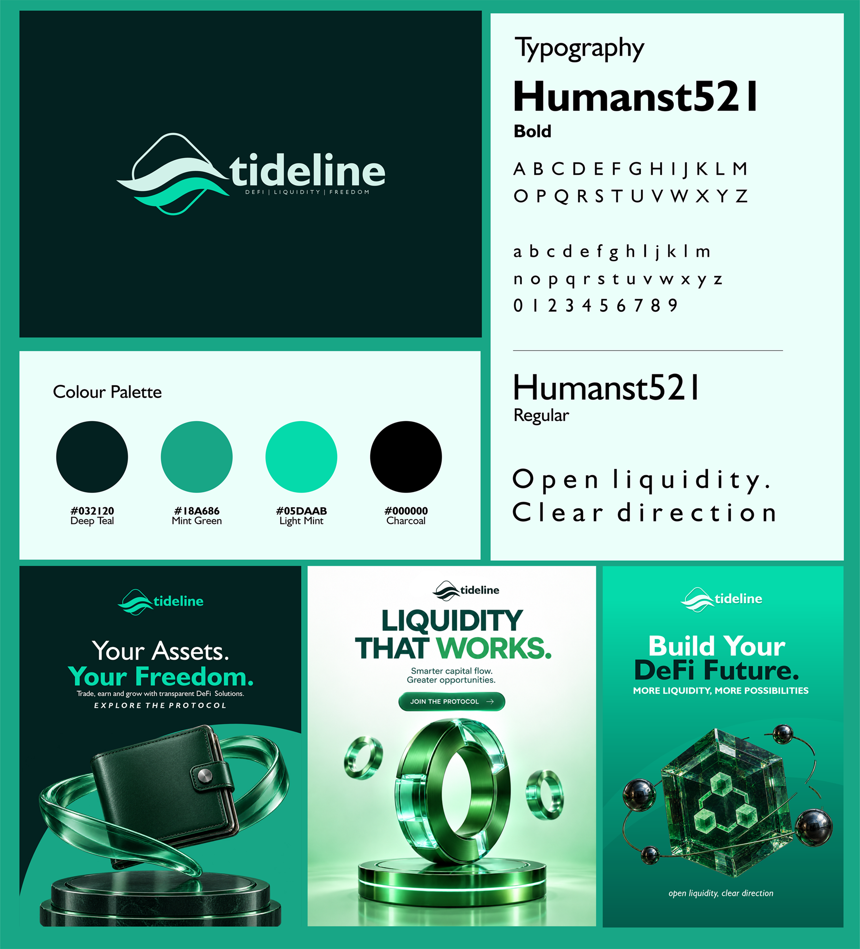
Tideline is a DeFi brand identity built around the idea of liquidity as a steady, readable current. The system covers logo, typography, colour palette and a set of campaign key visuals.
Visual direction
Observations from the original artwork, not a claim of documented research or testing.
- 01Shaped a wave mark contained in a soft diamond — movement held inside structure.
- 02Paired the mark with Humanst521 for a humanist, approachable tone.
- 03Built a teal-and-mint palette that reads as finance-grade yet fresh.
- 04Extended the system into 3D campaign visuals with one message per frame.
Typography
Aa
Humanst521 Bold
Headlines & logotype
Aa
Humanst521 Regular
Body & taglines
Color palette
Deep Teal
#032120
Mint Green
#18A686
Light Mint
#05DAAB
Charcoal
#000000
Motion
Motion design case study coming soon.
Visual assets
Presented assets
- Logo & wordmark
- Typography system
- Colour palette
- Campaign key visuals
- Motion piece (in progress)
Next project